Balance°C is a vitamin supplement brand with a new packaging design that different from the current market. Each container has a unique shape to simulate our bones, hearts, and eyes. Also, the containers use sustainable packaging materials and each bottle is designed to be reusable.
Brand name
The brand name concept derives from a dynamic balance between a person’s health and the environment. The brand is to let consumers feel safe and warm, so that’s why it uses the °C. The brand tries to let customers feel its passion for the brand, so the °C gives the feeling of warmth and the brand’s passion.
Logo design
After the decided brand name, I started to create various logo. Finally, the logotype is designed with a simple and clean geometric typeface to show a scientific feeling while expressing the purity in our products. Since the logo is simple and easily legible, it can give off the sense to the consumers that the product is safe, clean, and pure without any harmful ingredients in the formula. Also, the logotype is designed with different colors based on the functions.
Typography & Colors
The product is about healthcare, so the color should provide trust, professionalism, and knowledge. The colors used are bright and easily distinguishable when they are used to differentiate products.
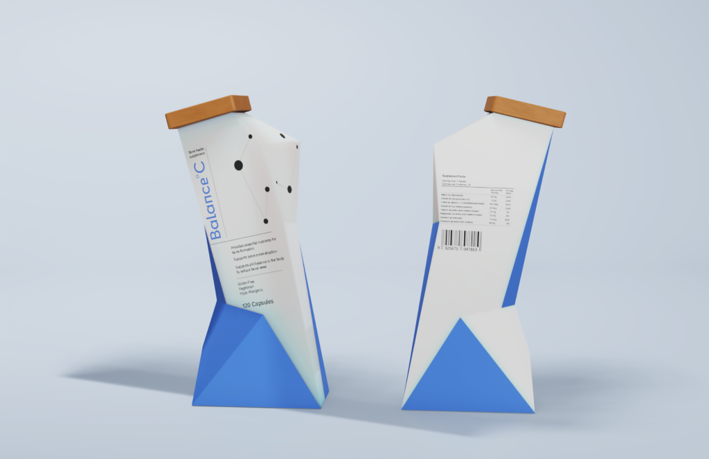
container Design
The design of the health supplement container is to provide a geometrical, simple, and modern look, and then each bottle is designed with a unique shape to simulate our organs, so it allows people to recognize the brand right away without second thoughts.
3D Final look
The shape of the bottle is to simulate the heart
The shape of the bottle is to simulate the bone
The shape of the bottle is to simulate the eye
Let's Connect
Feel free to mail me or send me a direct message via LinkedIn.
I’d love to chat about my projects or anything else!